According to color psychology, colors are generally classified into three categories: warm colors, cool colors, and neutral colors.
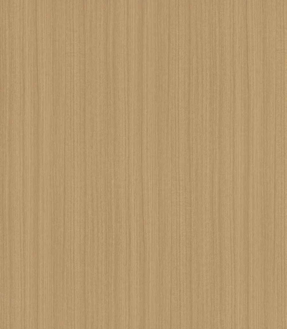
Warm colors are primarily based on red, orange, and yellow tones. These colors are often associated with sunlight, fire, warmth, and energy. Wood grain PVC films featuring warm oak, walnut, teak, or golden wood tones can create a welcoming and cozy atmosphere, making them ideal for living rooms, dining areas, hotels, and other spaces where comfort is important.
Cool colors, on the other hand, are dominated by blue, green, gray, and certain dark shades. Examples include charcoal gray, deep brown, dark green, blue-gray, and black wood grain finishes. These colors tend to create a calm, sophisticated, and modern appearance. Cool-toned furniture surfaces are frequently used in offices, contemporary residential interiors, and commercial environments where a clean and professional image is desired.
Neutral colors, such as beige, taupe, soft gray, and some muted wood tones, fall between warm and cool colors. They provide excellent versatility and can easily complement various interior design styles.
Color is the result of visible light being reflected from an object's surface and perceived by the human eye. The visible spectrum ranges approximately from 400 to 700 nanometers, producing the familiar sequence of violet, blue, cyan, green, yellow, orange, and red.
Generally speaking, colors closer to the blue and green end of the spectrum are perceived as cooler, while colors closer to yellow, orange, and red are perceived as warmer. This physical phenomenon, combined with human experience and cultural associations, shapes our emotional response to different colors.
The feeling of warmth or coolness associated with a color is largely influenced by everyday experiences. Warm colors remind people of sunshine, fire, autumn leaves, and natural warmth, creating a sense of energy, comfort, and friendliness. For this reason, warm wood grain PVC films are often selected for residential furniture and hospitality projects.
Cool colors are commonly associated with blue skies, water, snow, and shade. They convey a sense of calmness, stability, and elegance. Furniture surfaces finished with cool-toned wood grain films can make a space feel more spacious, organized, and contemporary.
In addition, color can influence visual perception of space. Dark and cool-toned colors generally have a visual contracting effect, making furniture appear more compact and refined. Lighter and warmer tones tend to visually expand a space, creating a brighter and more open environment.
When selecting a wood grain PVC film, consider the following factors:
1. Room Size: Light and warm wood tones can make smaller spaces appear larger and brighter.
2. Interior Style: Modern and minimalist designs often favor cool gray or dark wood finishes, while traditional and rustic interiors benefit from warm oak or walnut tones.
3. Lighting Conditions: Natural and artificial lighting can significantly affect how a wood grain color appears in practice.
4. Desired Atmosphere: Warm colors create comfort and intimacy, while cool colors promote calmness and sophistication.
The perception of color temperature is both psychological and visual. Warm, cool, and neutral wood grain PVC films each offer unique aesthetic and emotional qualities. By understanding how color influences mood, spatial perception, and design harmony, manufacturers and designers can select the most suitable wood grain PVC film to enhance the beauty and functionality of furniture and interior spaces.